Solution
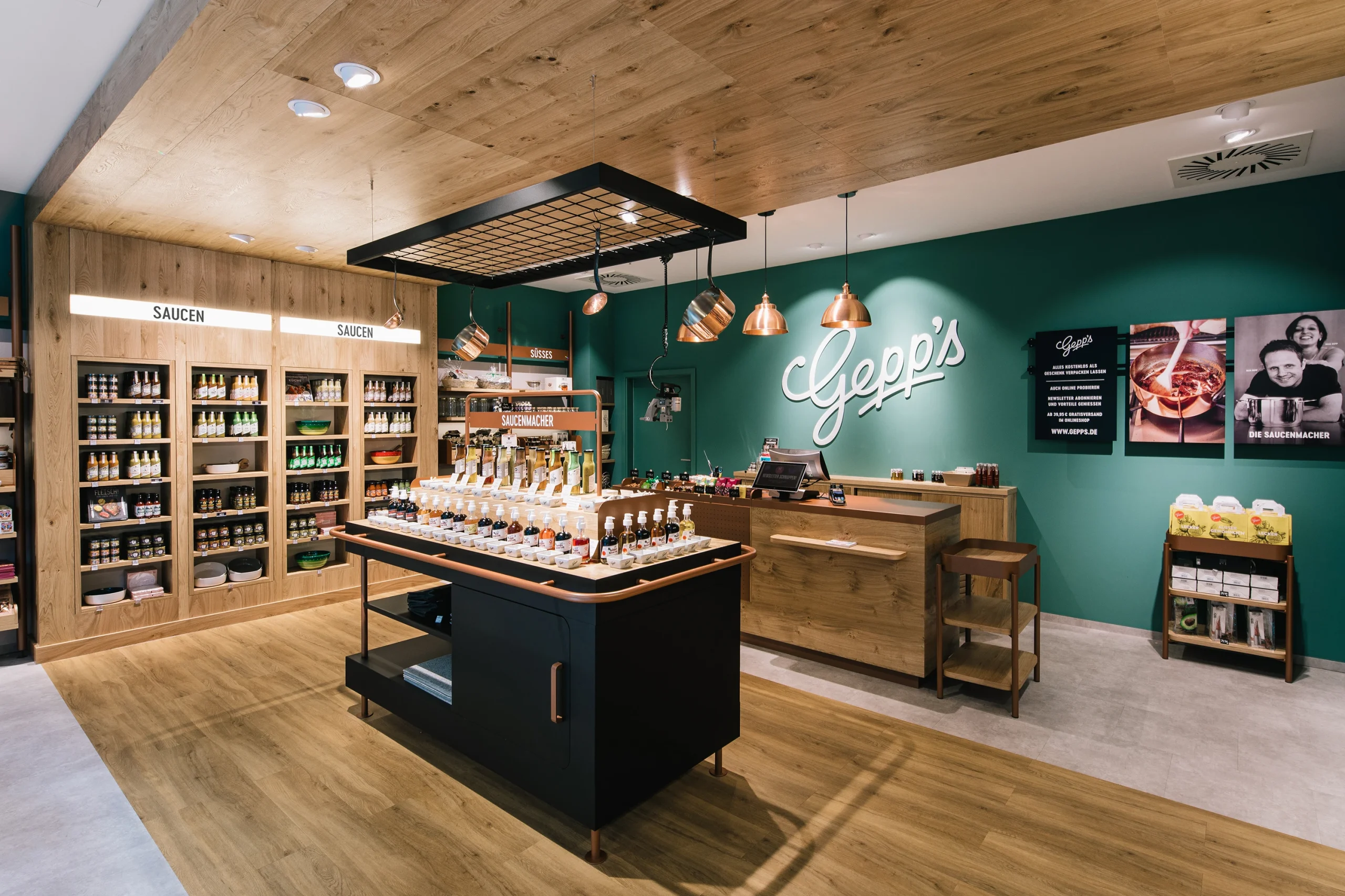
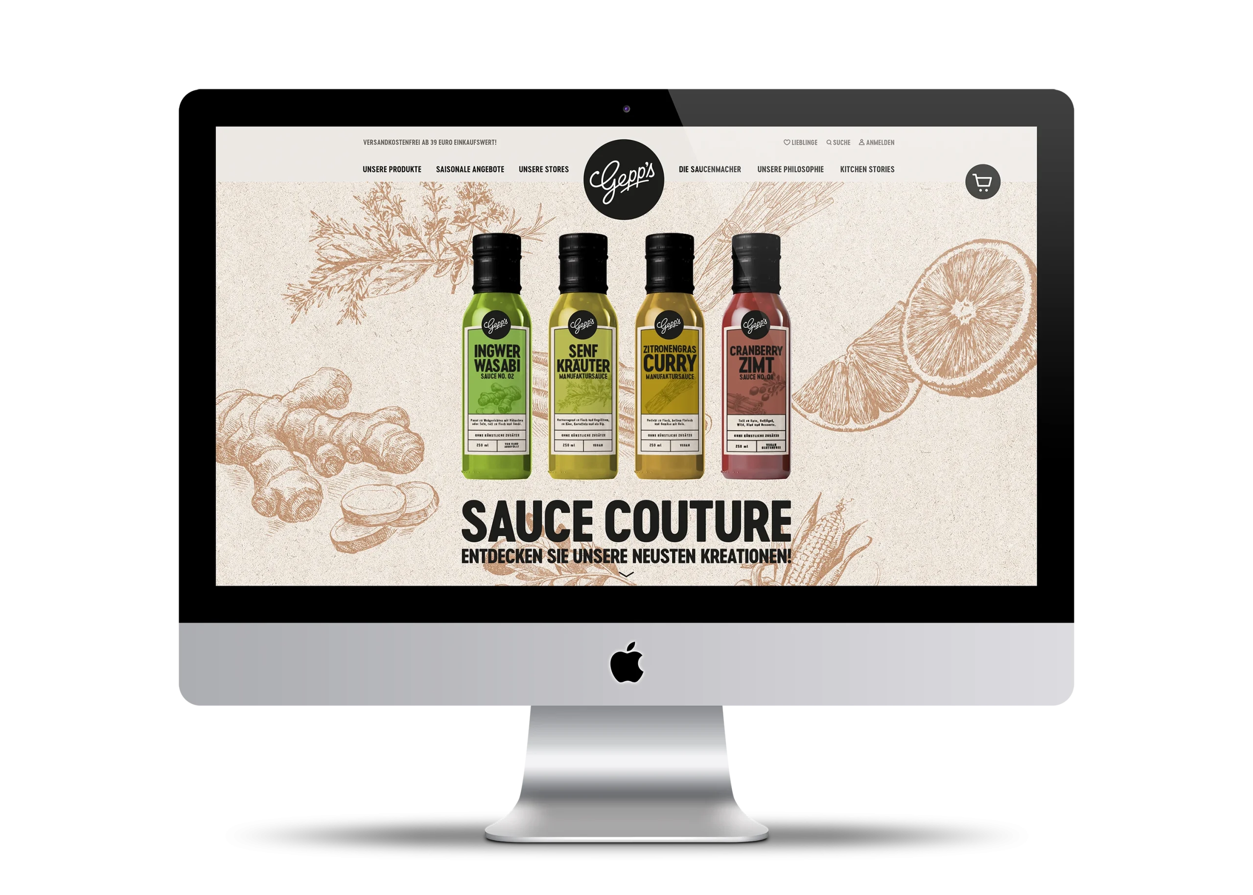
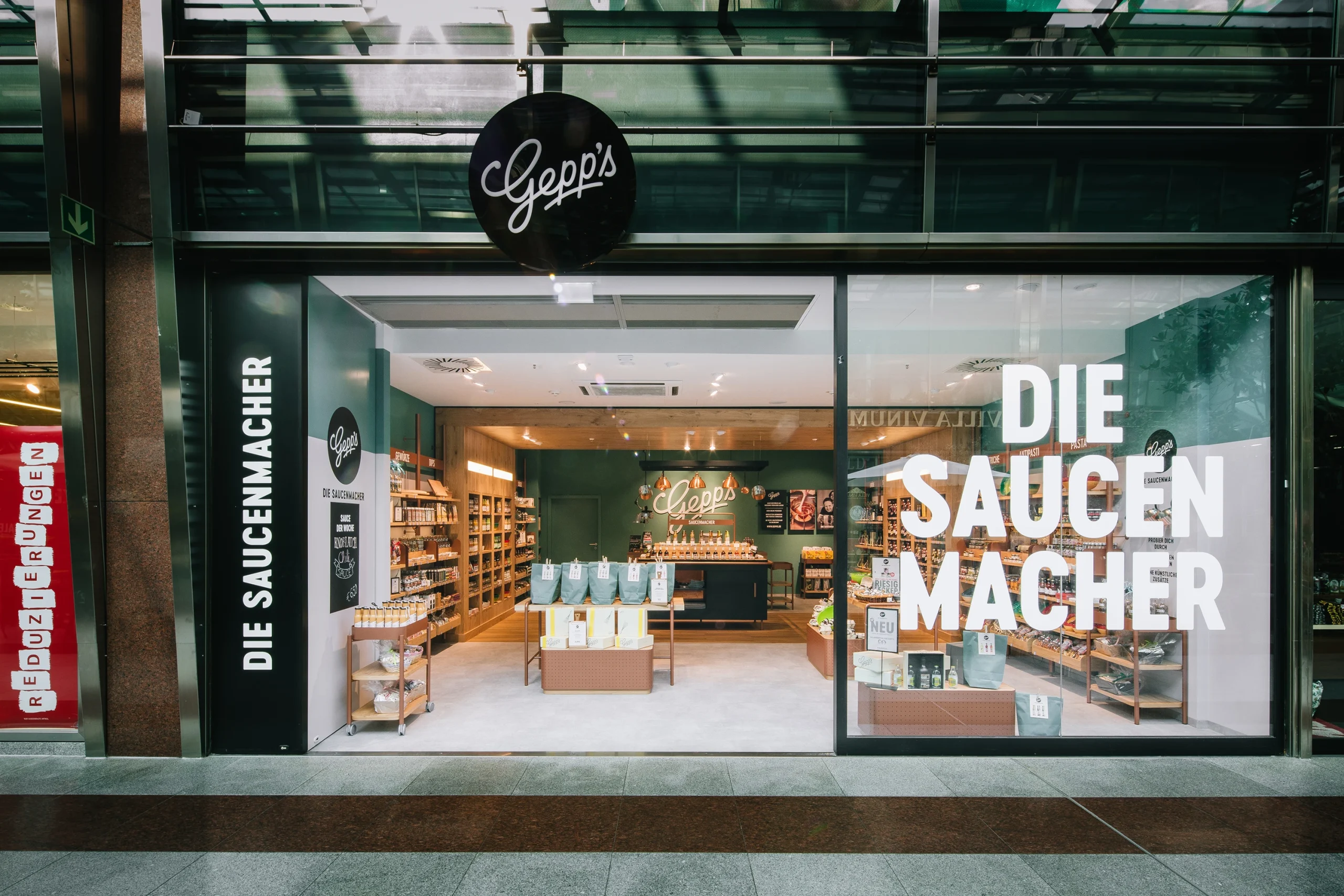
For the designers, the fresh ingredients of Gepp's sauces and the down-to-earth founders formed the basis of the new design principles of clarity, naturalness and personality. Translated into a visual language, this means reduction to the essential: the circular logo is reduced to the brand lettering, without any other decorative elements. The color palette focuses on a few muted tones such as sage green, black and white with highlight colors inspired by nature. In addition to the corporate design, we developed a new packaging design concept that assigns the products a clear information hierarchy and color coding for a high-quality look and clear sorting within the range. Based on the creative identity, a store design was created that places the product experience and the brand in the spatial focus.


